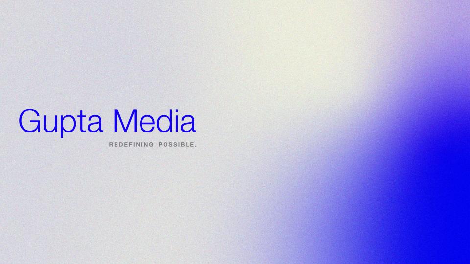
Gupta Media
During my Summer 2022 internship at Boston-based marketing and creative agency Gupta Media, I worked closely with the entire creative team on a variety of assignments. As a larger project, I was tasked with overhauling the capabilities deck, which is often sent to prospective clients in order to set Gupta apart and provide a portfolio of work.
I was also limited to Google Slides, as the deck had to be easily modified by non-creative staff. Despite the limited toolset available, I knew I wanted to break away from the typical static slideshow. I developed motion graphics which, in GIF form, provided dynamism to otherwise motionless slides. I also streamlined existing color palettes and fonts. The resulting deck and graphic elements are still beign used company-wide in a variety of presentations.
The problem
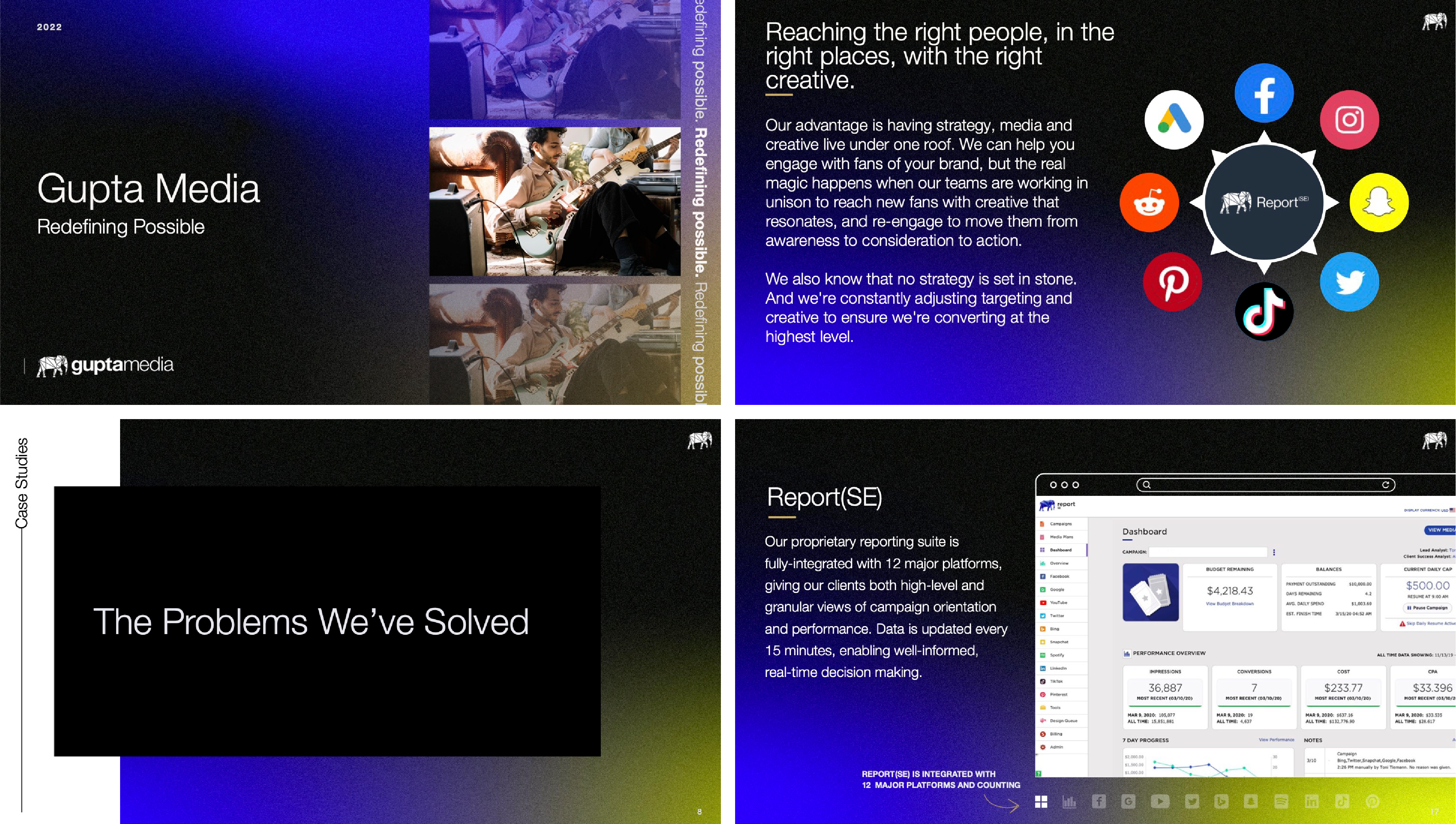
The previous iteration of the capabilities deck had compelling content, but as material meant to impress other agencies and possible clients, it lacked creative spark. With a dark color scheme and inconsistent layout, as well as imagery and graphics that were often busy and unrelated, it felt dated and lacked a cohesive visual language. Some of the slides just needed some cleaning up, and many needed a complete overhaul. Below are excerpts from the existing deck I was tasked with redesigning.
Color
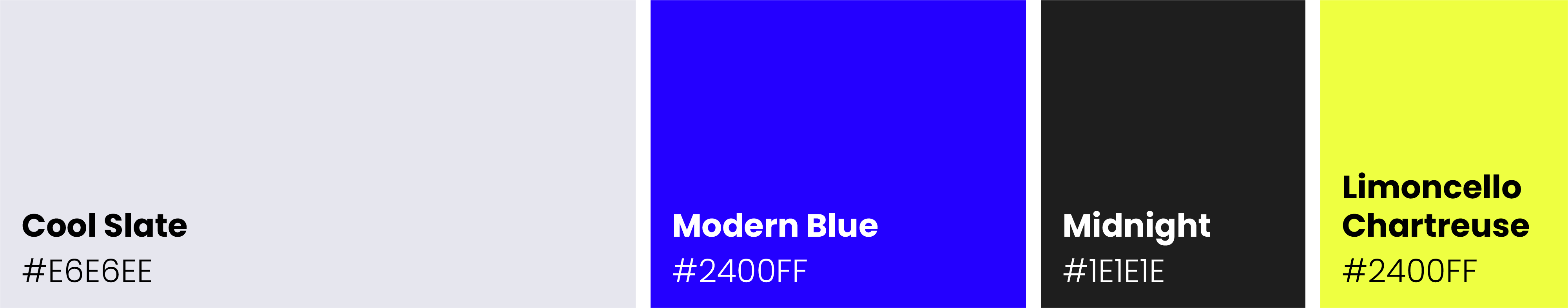
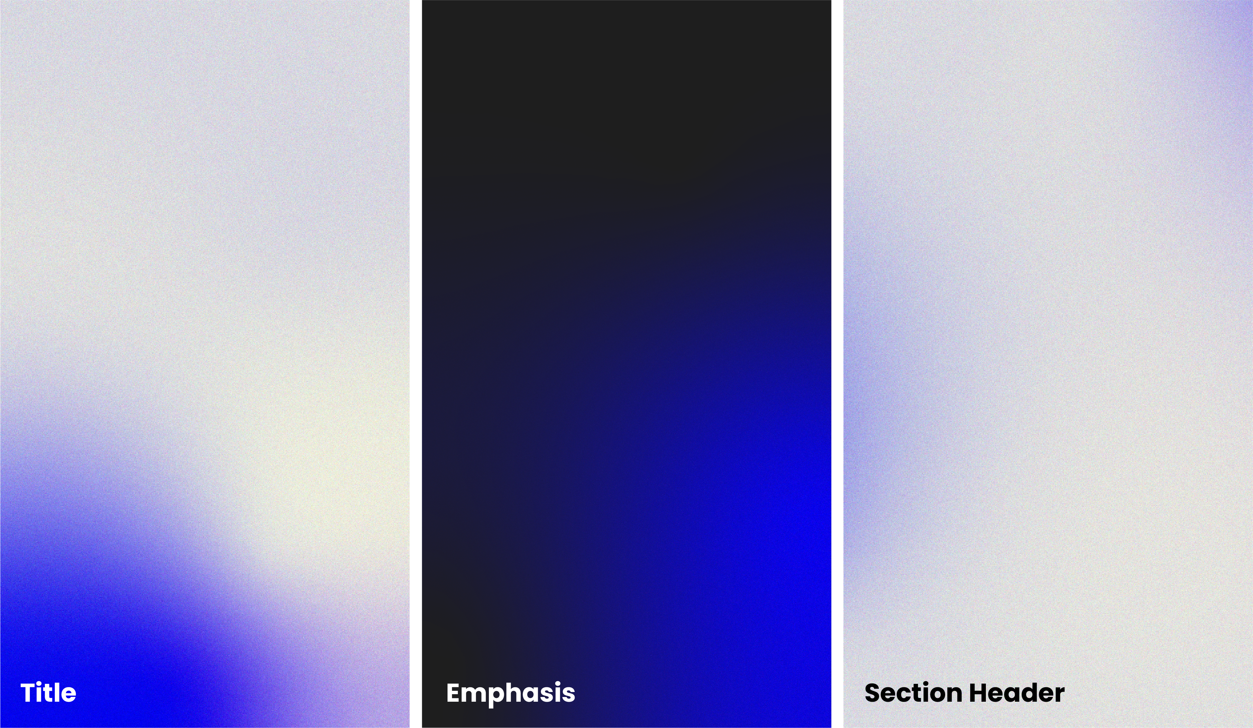
The first thing I changed during the redesign was the overall color palette. Pulling from existing guidelines, I created new gradient styles for headers and body slides. I transitioned to a slate gray and bright blue color scheme, moving away from the black, blue, and yellow, which felt too tech-y for a marketing agency. I used a separate dark theme sparingly to place emphasis on certain topics. I also digitized the logos of partner companies and kept their coloring consistent.
Motion
One of the biggest changes I implemented was the introduction of motion, which helped the presentation to feel lively. Although Google Slides does not natively support motion graphics, I was able to convert animations to GIF format. Paired with native slide transitions used in unique ways, this was a massive improvement, creating points of interest throughout which helped to highlight the capabilities and accomplishments of Gupta Media.
Typography
The existing deck used inconsistent fonts, sizes, spacing, and copy layout. I streamlined the typography, switching from Questrial to Poppins due to its breadth of families, and keeping consistency across slides with Helvetica Neue. This was also intended to allow media-side staff at Gupta to edit copy without disturbing visual coherency.

The Results
After putting all of these pieces together, the resulting presentation received high praise, and was put into use after several iterations. The gradients and motion assets I developed are also used across other internal and client facing decks. Click through below to view the finished product, or click here for a full screen view.