As design editor, and subsequently managing editor, for
The College Hill Independent,
I led creation of a cohesive aesthetic language for the newspaper.
This included font curation, template creation for different sections,
compiling and finalizing the full paper, and editing all the layout work done by a team of 12 designers.
As managing editor, I was tasked with leadership over the entire publication,
which included editing the full paper, working closely with all editors,
and fundraising to provide stipends to staff members.
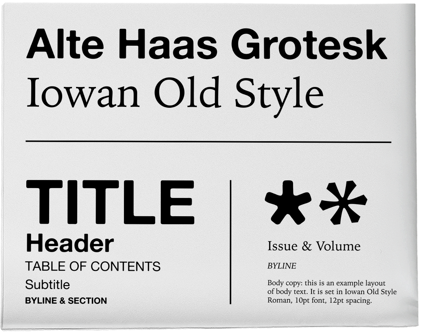
Typography
For the redesign of the newspaper, we wanted to emphasize the
print-first nature of the Indy. The sans serif we chose was an example
of this. With its rounded and imperfect qualities,
Alte Haas Grotesk
provided another layer of materiality to the paper. The serif,
Iowan Old Style,
was chosen for accessibility due to its high x-height and crisp letterforms,
which also complements the heavier Alte Haas.
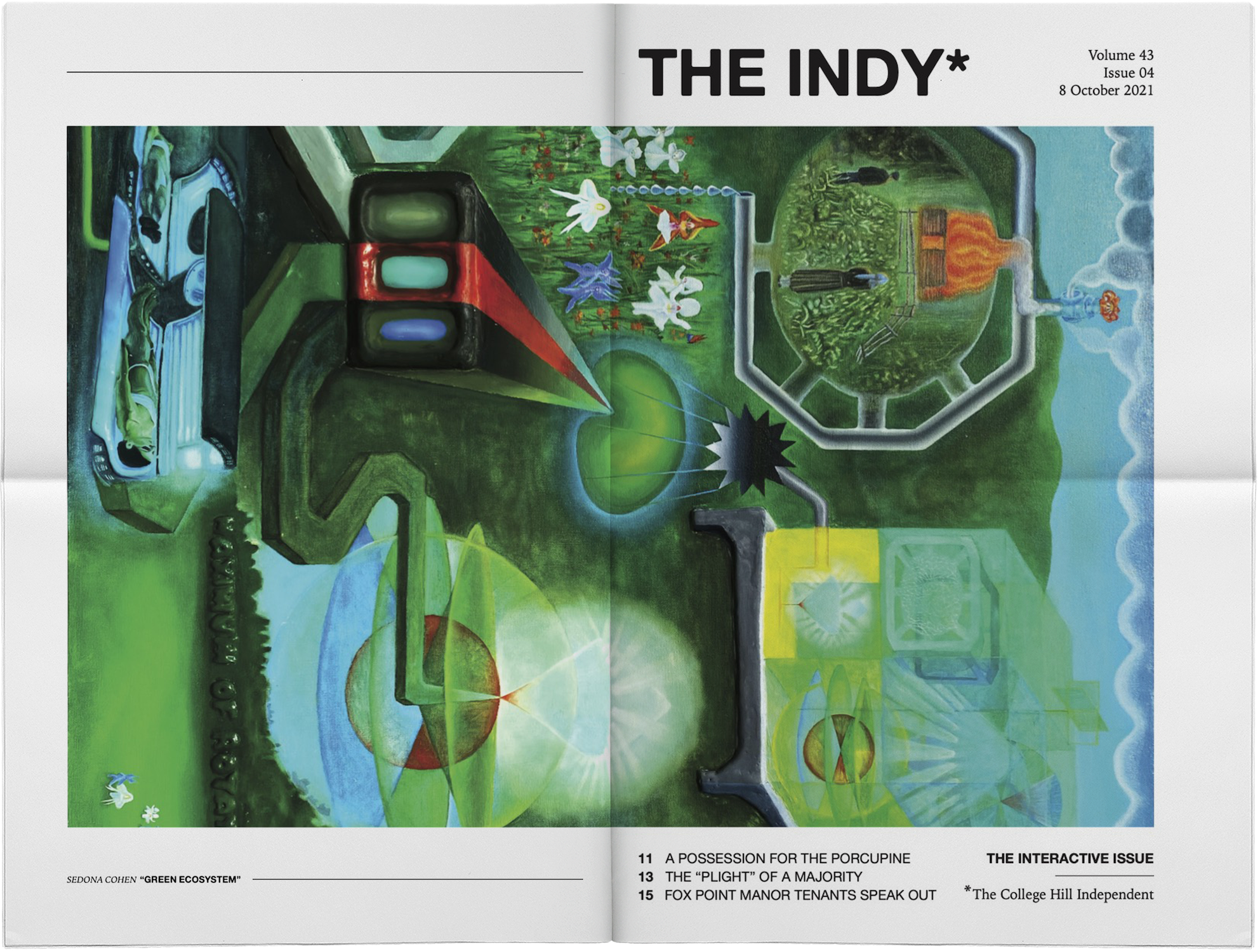
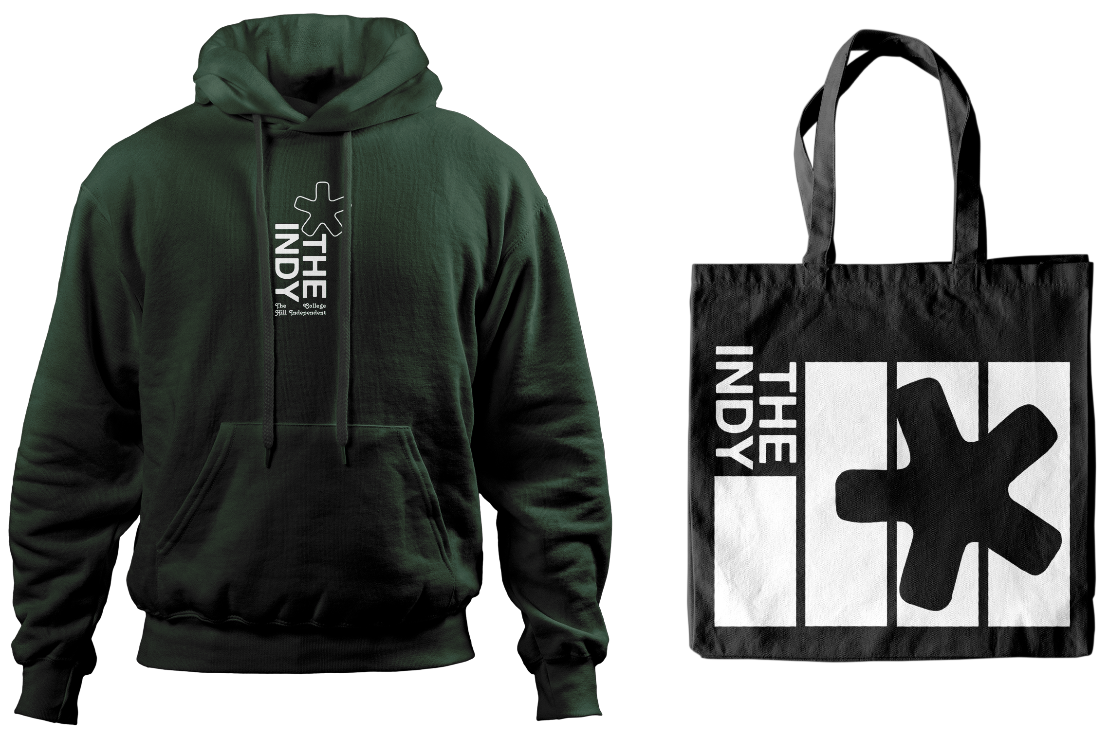
Graphic Identity
To me, typography is the defining graphic element of a newspaper, so
it felt fitting that the logo be a piece of type. Additionally, the Indy
is a progressive publication with a rigorous editorial process, and we always felt like there was more to
publish that wouldn't fit in 20 pages. The asterisk, representing contextual and
important information, was an apt and recognizable logo, and it
helped to build a brand for our fundraising merchandise.
See more
The Indy publishes online at
theindy.org.
To view print issues, including volumes 43 and 44, click
here,
or visit any of our newsstand locations around Providence, Rhode Island!